SINGAPORE - Boundaries usually spark creativity - and this was the case for this one-bedroom, 600 sq ft condominium apartment in Whampoa.
Designer Kelvin Teo of home-grown firm Space Sense Studio was tasked with making the most of a limited space. Under his supervision, the apartment - the home of a couple in their 40s and early 50s, who did not disclose their occupations - underwent a significant reconfiguration that cost $100,000 and took three months, with the circuit breaker in between.
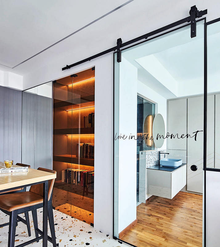
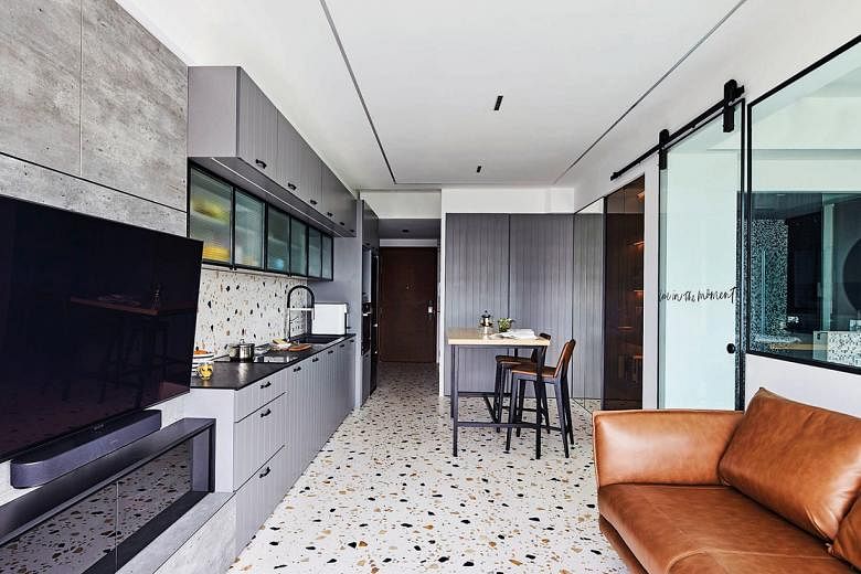
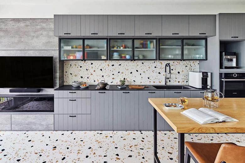
He moved the kitchenette to the other side of the communal area, stretching partly into the open-concept living room. He also removed most of the wall between the bedroom and living space, opting instead for a sliding glass door and a half-wall to let natural light pass through.
A dining table and a screed-backed display shelf with a collection of books and knick-knacks take up the rest of the space. Backlit by LED lighting and partially visible through a sepia-tinted sliding glass door, the collection looks like an archive of antiques, in line with the owners' request for a mid-century modern look.
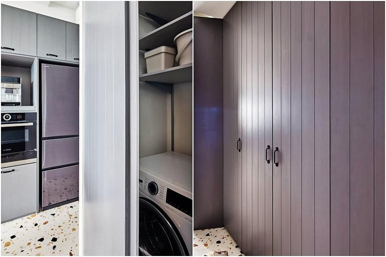
Other design elements include terrazzo tile flooring in earthy tones, which matches the kitchen backsplash, and frosted glass cabinet doors that reveal some of the contents without being visually intrusive.
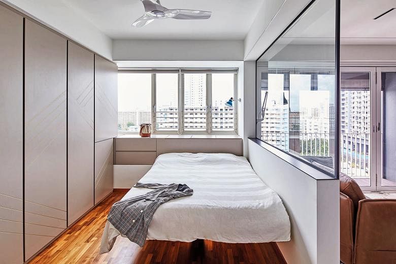
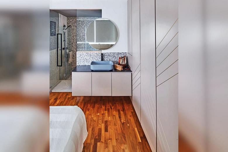
Maximising the existing space in the bedroom and bathroom was another challenge. Mr Teo relocated the sink and vanity area to the bedroom to make more room for the shower area. The wall separating the bedroom and bathroom was also partially removed to let more light through. Then he had the vanity mirror mounted to create a "floating" look - an effect echoed in the cantilevered bed that appears to hover above the floor.
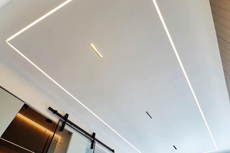
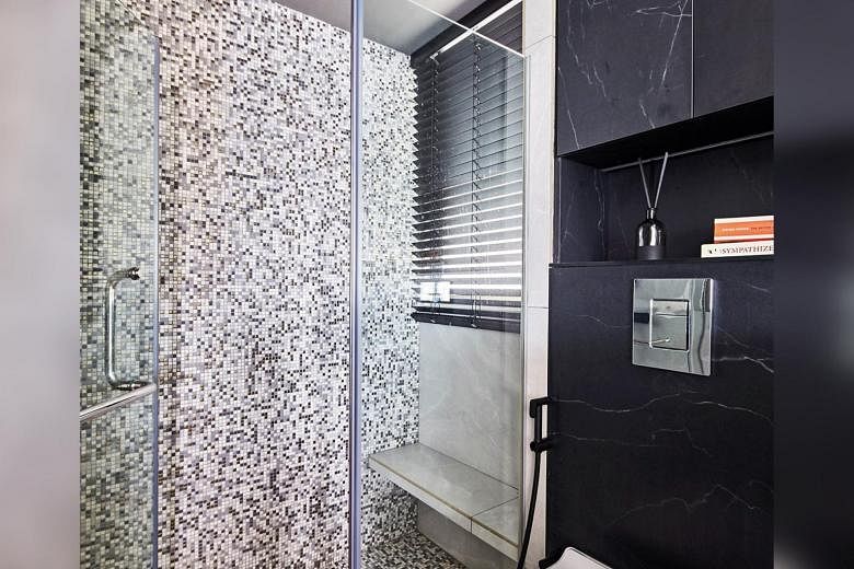
Even the lighting design had to be clean and uncluttered. There are no large statement lamps, which would too much space. Instead, Mr Teo opted for a streamlined design with subtle LED lighting and downlights. He also added reflective elements like a large, full-height mirror in the dining area and gold detailing in the bathroom's mosaic tiles so the light bounces off them.
The couple also wanted him to include as much storage as possible, so Mr Teo incorporated storage space into the dining area and entrance foyer. These house the couple's shoes and even utilities such as the washing machine and dryer, which are tucked out of sight behind cupboard doors. To aid visual flow, everything is painted in the same neutral grey and white.
This article first appeared in the September 2021 issue of Home & Decor, which is published by SPH Magazines. Get the November and latest issue of Home & Decor now at all newsstands or download the digital edition of Home & Decor from the App Store, Magzter or Google Play. Also, see more inspiring homes at the Home & Decor website.